The Feeling Of Good Pixel Art And Curse Crackers
Who doesn't have high standards for how their video games look? We're in the age of far greater than 64-bit machines, obviously. I can't play anything that doesn't have the latest bump mapping or texture generation, reticulated splines, and all of the nonsense I'm sure the little code monkeys that make things like 'high definition computer graphics' are capable of whipping up. Who isn't stunned when they put in a CD for Neverwinter Nights and get blown away by the pre-rendered cutscenes and simulated cloth physics as they stalk the corridors, temples, and alleyways of the city of Neverwinter?
Of all the games I've played for startmenu many of them haven't looked 'great' by this metric - truly cutting edge, truly wondrous to behold in motion. It's so hard to come to terms with that, I rarely mention graphics in the way I write reviews. Other eras of video game press might take me to the pyre to be burned for various sacrileges.

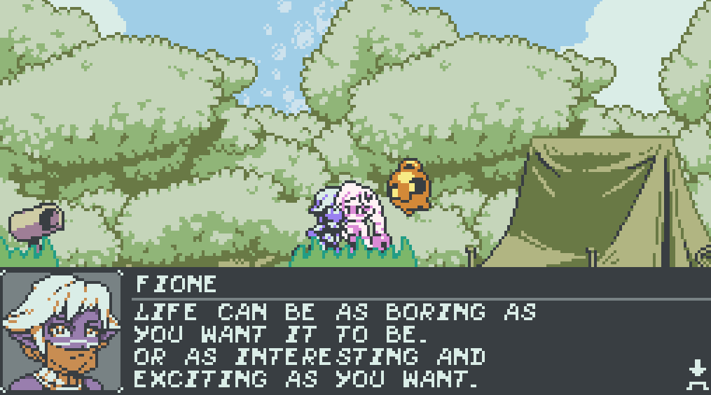
Curse Crackers: For Whom The Belle Toils is an actrobat-platformer for the PC and Nintendo Switch. If you go to Google right now and search the title of the game, articles may be found calling it a GameBoy Color-inspired platformer. Let's talk about pixel art. Are you ready?
A petty grievance I weigh against a lot of video games now is having sprite-art but not necessarily great pixel art. There are cybernetic-ninja platformers in the dozens, old arcade platformers given modern and thorough facelifts. Super Nintendo throwback games out the wazoo, and where I hold all of them in my head is that generally as soon as I've put the controller down (reviews or non), I completely and totally forget what they look like.
I have never, in my entire life, forgotten what Cave Story looks like. Let me get with you right now - I can close my eyes and see Cave Story. I know that Quote (the protagonist of Cave Story)'s head is made up of a 14x8 pixel square offhand at all hours of the day. The diminutive proportions of the characters and massive catacombs and sprawling, watercolour-esque backgrounds of the original release breathe life into the time the player spends on Mimiga Island.
There's no coherence to the way retro aesthetics are pilfered or decided on - and to disagree with my own sentence, not every decision to use pixel art is deliberately trying to steal or harken back to a specific title or console. Curse Crackers has beautiful pixel art in every way: a managed color palette that leans into the way older consoles might have used restricted colour usag,e while at the same time using a great deal more color than something like the Gameboy Colour or even the Super Nintendo could have used.

Here's a test for the next time you're playing a pixel art platformer: have you ever mistaken something in the foreground for something in the background? Have you missed a precision jump because an object wasn't clearly not a platform? It's the sort of small thing we take for granted as 'good game design'. One of the things that I like so much about just spending time in Curse Crackers is the use of hue to fade the background away from the foreground and make everything seem like an elaborate set behind the characters. A world of vibrant shapes and colour stands just where I can't reach it as a player, with little cutout characters to interact with.
It takes about eight hours to see the front of the stage of Curse Crackers. Underneath all of the set dressing is an entire B-plot with characters and palettes not seen in the first half that shows perseverance with the regular mechanics. It's not asking much for a game so crammed full of little details from the team of artists that put other games that try to nail pixel art to shame. The devil is, as always, in the details.